
All of us, who usually give talks, classes, conferences, seminars, webinars, etc … should sometimes reflect on how the participants at these events are seeing the images or graphs that we show to them. Especially when we use color codes to underline or illustrate differences between two different ideas or concepts, which we want to mark as different. Because the reality is that not all people perceive colors in the same way.
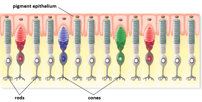
My son is color blind. He has a type of color blindness called deuteranopia, in which his retinal green cone photoreceptors are not functional. In our retina we have specialized neurons called photoreceptors that contain sacs filled with proteins, called opsins, which are sensitive to light and react to different wavelengths. There are two main types of photoreceptors: rods, which react to low light intensities, do not transduce colors but grays (white / black), have low resolution, saturate very quickly (we usually use them in low light conditions, at night …) and whose opsin is called rhodopsin; and, on the other hand, we have cones, which transduce colors, with high resolution and of which we have three types, depending on the opsin they contain, reacting to green light (green cones), red light (red cones) or light blue (blue cones). The photoreceptors translate the light they perceive into an electrical stimulus (phototransduction) that they transmit to other neurons in the retina and finally reaches the visual nuclei of the brain where this set of stimuli is finally interpreted as images. This is how we see the world. Our retinas are the sensors that capture the light that comes to us from objects and it is finally our brain that transforms what we see into images.
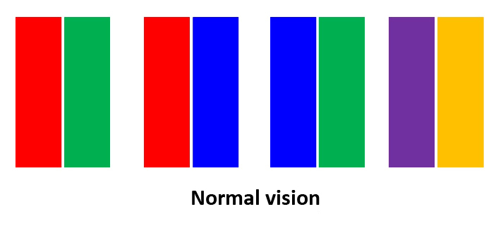
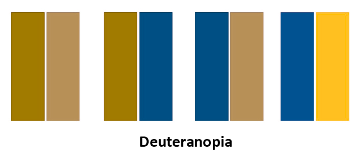
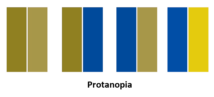
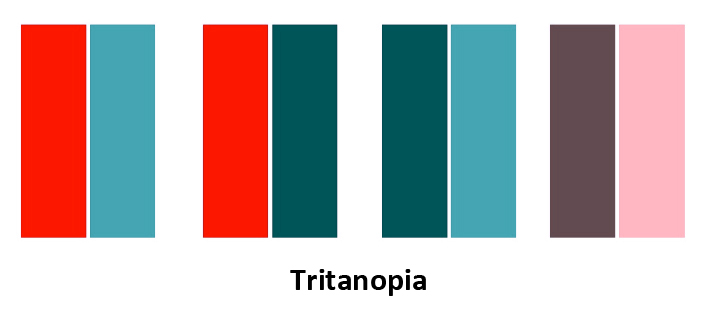
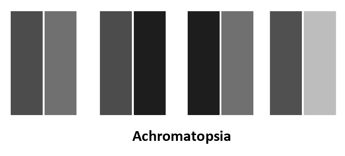
As you can see in the five images of color bars, at the top of this article, there are people with alterations in color vision who perceive colors differently from how a trichromatic person can see them, with a vision that we could qualify as «normal» , with all its various functional cones. This is a fact that we must take into account when illustrating our presentations. There are different types of alterations in color vision, which is popularly known as color blindness (a concept established by John Dalton, and English scientist who had precisely one of these alterations). People with non-functional green cones present deuteranopia (which affects 6% of men and 0.4% of women), those with non-functional red cones present protanopia (which affects 1% of men and only 0.01% of women). Tritanopia (non-functional blue cones) is very rare and affects men and women equally (0.01%). Finally, the inability to perceive color or monochromatism (when all three types of cones are affected) is called achromatopsia and is a relatively rare genetic condition, affecting approximately 1 to 9 in 100,000 people (and it is usually estimated between 1 in 30,000 to 50,000 people). The sum of 6% and 1% explains that there are approximately 7% of men with color blindness, while the number in women is much lower, around 0.4%.
Please note that in a class of ~ 600 people, assuming 50% of each sex, 300 men and 300 women, there may be about 21 color-blind men and probably one color-blind woman. These are important and significant figures to consider, to ensure that the education we provide is inclusive and respects the visual functional diversity of our students or those attending any event in which we use a powerpoint presentation to illustrate our class or talk.
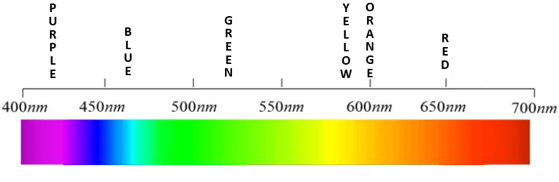
This figure that I show above, depicting the light spectrum visible by the human eye (through the retina) reminds us that we are capable of detecting short wavelengths (around 400 nanometers, purple color) to longer wavelengths (around 700 nanometers , red color). Hence, the three types of opsins (and the cones that contain them) are also known as L (long), M (middle) and S (short) according to the wavelengths to which they react, red, green and blue, respectively. The genes encoding the L (OPN1LW) and M (OPN1MW) opsins are clustered on the X chromosome. The genes encoding the S (OPN1SW) opsins are located on the 7 chromosome. The number of genes of each type and their organization (caused by homologous recombination, due to the great similarity between them) is variable in each person. Therefore, the genetic diagnosis of color blindness is not trivial at all. Men (being XY) are more likely to show color blindness associated with alterations in opsins M (deuteranopia) and L (protanopia), while for a woman (being XX) to present color blindness, they must have the affected genes on both X chromosomes. And, also for this reason, this explains why there are no differences in terms of sex in relation to color blindness of the tritanopia type, which is on another autosomal chromosome.
A careful observation of the color bars in the first figure, at the top of this article, and that of the light spectrum allows us to see why the colors purple (violet) and orange are the colors that are best perceived as different regardless of the type of color blindness that a person has. They are practically at both ends of the spectrum and transmit maximum contrast, which is not lost when color perception is altered, whether in deuteranopia, protanopia, tritanopia and even in the absence of colors, in achromatopsia. That is why I always recommend using purple and orange to illustrate ideas or concepts that we want to present as different in graphics. If we do this, regardless of whether whoever is following the talk has a trichromatic, monochromatic vision or some other type of color blindness, they will continue receiving the correct information and will perceive those two concepts or ideas as different.
Have you noticed the color of the letters in the name of my blog: GENETICA? Look at the top of this page. You see?
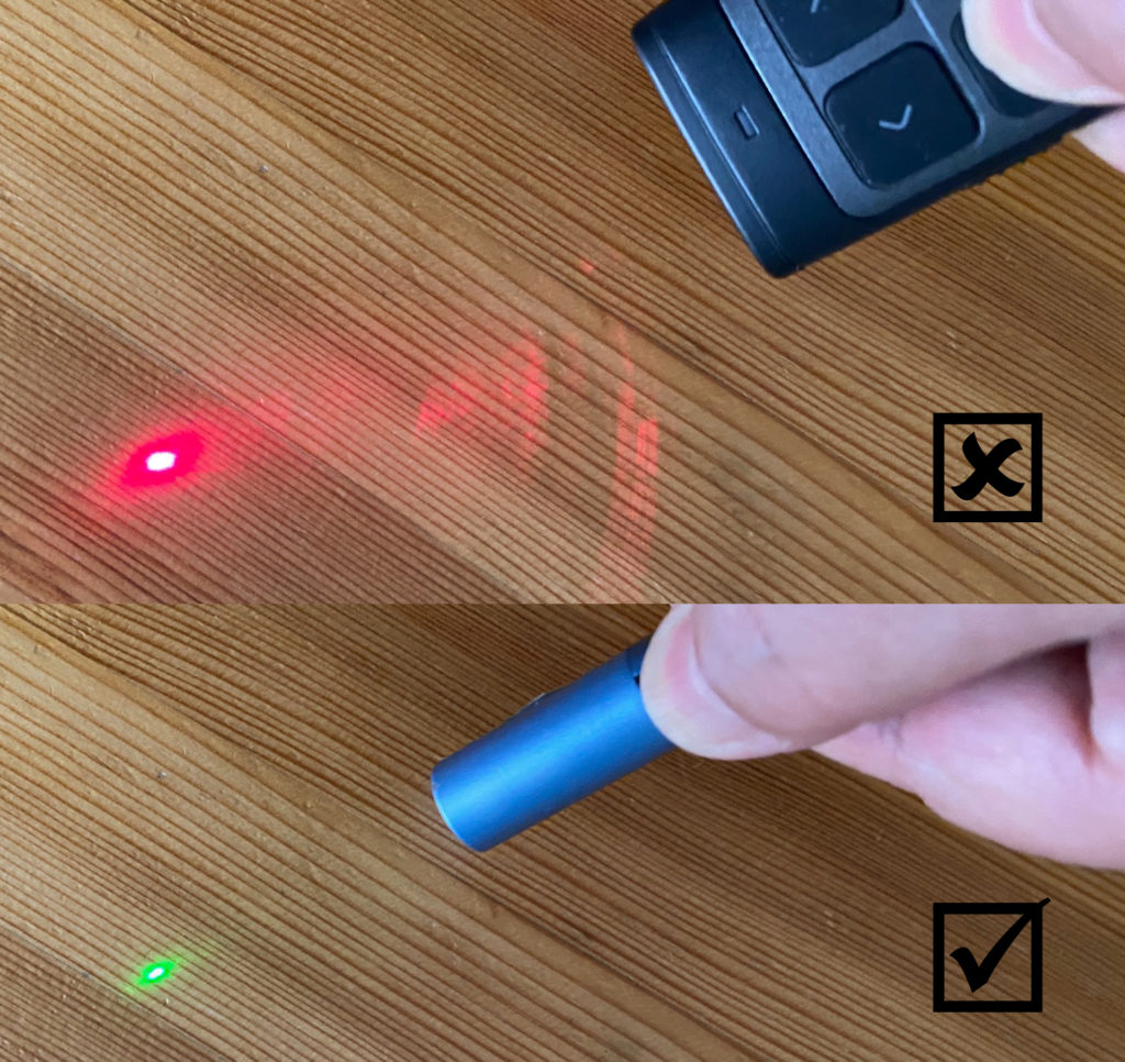
An additional recommendation when giving talks to people who may have some type of color blindness is to avoid using red laser pointers, since most people with color blindness will not see them or will perceive them with difficulty, and it will be difficult for them to follow where the speaker is pointing. On the contrary, all of them will see a green laser pointer much easier, which is the one that I recommend using at all times. In anticipation that someone with color blindness will be in the audience.
Finally, I want to comment that there is a lot of diversity among people with some type of color vision defects. There are many types of people with color blindness, and not all of them see the same thing or perceive colors in the same way, despite being classified within one of the indicated color blind categories. The great genetic variability existing between individuals, in terms of the number of opsin genes and their organization in the genome, combined with the fact that many mutations can affect any of the copies of these opsin genes, result in multiple variations and alterations, not all of them always associated with a total inactivation of the function of the protein, but in many cases associated with partial alterations. Hence, there are intermediate types of color blindness called deuteranomaly (the green cones are altered in some way and do not work properly), protanomaly (the red cones are altered in some way and do not work properly), tritanomaly (the cones blues are altered in some way and do not work properly) and other variants such as blue cone monochromatism (in which neither the green nor the red cones work, only the blue ones). Blue cone monochromatism is very rare, similar to achromatopsia (~ 1 to 9 out of 100,000 people) and also affects mostly men, as the dysfunction of the green and red cones is X-linked. Achromatopsia is equally variable and is caused by alterations in at least six other genes necessary for phototransduction in the cones (GNAT2, ATF6, PDE6C, PDE6H, CNGA3, and CNGB3), and again the alterations can be complete or partial. There are also other related disorders such as cone dystrophies.
Let’s see below what is the effect on the same initial color bars by simulating the visual alteration of colors in people who present some of these new types of intermediate color blindness, again using Color Blindness Simulator.
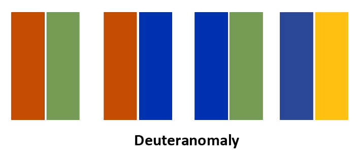
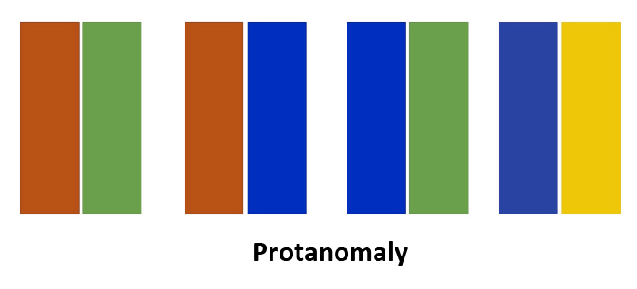
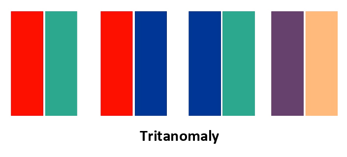
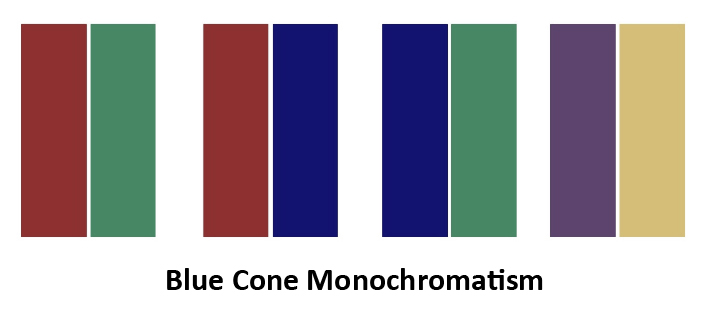
In all cases, a good contrast is maintained between the purple and orange colors, thus again being the recommended colors to use for any type of color vision defects. These are the two colors that guarantee that all our audience, regardless of any color vision disorder they have, will be able to follow our explanations and our graphics without any problem. It costs nothing and we make more people happy. Inclusiveness, respect for diversity. Furthermore, if we also use a green laser pointer we can even have them smile.
We can also complement the color code with other information of another type, playing with shapes, strokes or textures, offering multi-channel information that not only depends on color. This has been the pioneering proposal of the Coloradd initiative, which has developed a particular code to inform about colors without the need for those colors to be perceived.

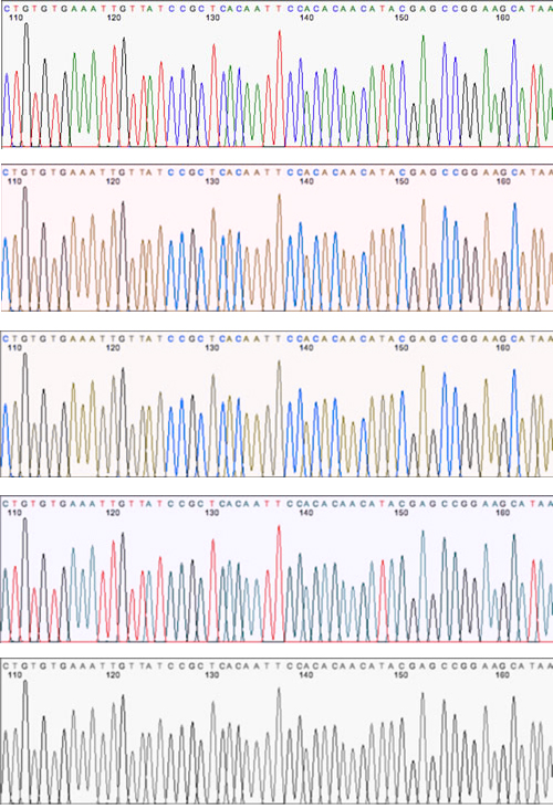
Color blindness or any color vision defect can be a challenge or a real nightmare for those who work in genetics. DNA sequencing using automated Sanger techniques produces colored chromatographic schemes in which the four letters of DNA, the four nucleotides: A, G, T and C, and their corresponding chromatograms, appear associated with these four colors: A (green), T (red), G (black) and C (blue). Therefore, people with color vision defects will have substantial problems to follow the corresponding curve for each letter when reading and interpreting these chromatograms manually, visually. Apparently, at least some of these programs allow changing the colors associated with each of these DNA nucleotides. Let’s see an example:
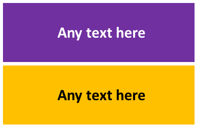
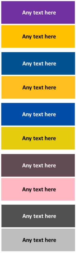
Finally, you may be wondering which text color, for legends or values, combines best with purple and orange. Well, in my opinion (also validated through Color Blindness Simulator), the text color that best matches purple is white and the text color that best matches orange is black. With these combinations you have the maximum contrast in any type of vision, and all people, color blind or not, will receive the information correctly. Look at the following example:
And, next, compare how this combination looks upon applying color vision defects in this order, from top to bottom: trichromatic normal vision, deuteranopia, protanopia, tritanopia and achromatopsia. I think it is clear that this combination maintains the maximum contrast against any type of color blindness.
This entry derives from a thread that I posted on twitter which was quickly shared by many people. Among the various responses received, you can find multiple resources that can be useful both for people with color blindness and for people who do not have any color vision defect, but can be relevant to those of us who teach classes or give conferences where we usually include illustrations with colored graphics. I have collected all these resources in the following list:
- SIM Daltonism application for Macs and Apple iOS devices. It allows you to select a filter with the type of color blindness and see through the iPhone how a person with that type of color blindness would see the world. Very useful to realize, at any time and place, how a person with color blindness sees something.
- Chromatic Vision Simulator application for Android smart phones. A simple but useful application that simulates different types of color vision defects.
- Coblis: Color Blindness Simulator. Web application that allows you to upload any image and transform it to how a person with a specific type of color blindness would see it.
- Color blindness (mathematically oriented explanation). In Spanish. An interesting website that explains the visual alterations of color blindness through a mathematical approach, prepared by Ernesto Laval.
- Color schemes and templates. Paul Tol’s notes. It offers different combinations of colors and contrasts perceived by all people, with and without color blindness.
- Crameri F, Shephard GE, Heron PJ. The misuse of color in science communication. Nat. Commun. 2020 Oct 28; 11 (1): 5444. doi: 10.1038 / s41467-020-19160-7. This is a scientific article that discusses strategies for using color codes in research papers so that they can be interpreted correctly for both people with and without color blindness.
- Toptal: Colorblind Web Page Filter. It allows you to analyze any website (by entering a URL) and verify how a person with a certain type of color blindness would see it. Very useful to validate if our websites can be perceived and understood also by people with color vision defects.
- HABI: accessible design. In Spanish. How do people with color blindness see the world? Visual examples of what colors look like by people with color blindness.
- DSO-X Colorblind Hack. How color blindness also affects the vision of hardware engineers and technicians. By Roberto Barrios.
- Coolors. A very interesting color palette generator.
- Viridis color maps. Color palette generator in R.
- Colbrindor. Color arrangement test. Test to determine the type of color blindness based on the ordering of colored pieces by tones. It discriminates better than the Ishihara test.
- Ishihara test. Classic test, developed by Dr Shinobu Ishihara in 1917 (!), to determine if a person has color blindness, although it does not discriminate between different degrees of deuteranomaly, protanomaly or tritanomaly. There are 38 plates in which some numbers appear visible or hidden depending on the alteration in the perception of color vision that a person has. It is the test that is normally used as the first filter to detect people with color blindness.
- Colblindor. Web portal with a lot of information about color blindness and its different types.
- Acromates. Spanish association of people affected by achromatopsia and blue cone monochromatism
- Resources. We are color blind. Multitude of resources for people with color vision defects, with some type of color blindness.
- Color Blind Awareness. Resources for teachers with students with color blindness.
- Color Blindness. Official information from the National Eye Institute, NIH-USA.
- Coloring for Colorblindness. Website to experiment with color palettes and see how people with impaired color vision would see them. By David Nichols.
- The naked eye (El ojo desnudo). Antonio Martínez Ron. Editorial Crítica, 2016. In Spanish. Splendid book that deals with vision from multiple points of view and also develops various topics related to color vision disorders.
I’m sure any of you, whether you are color blind or not, know other useful websites or applications that can serve to make presentations more inclusive and take into account the existence of people with color vision defects. If you know of any additional resource that is not yet on the list, drop me a comment on this blog and I will gladly look to include them. Thank you very much to all!
NOTE: This article is the English version of an original article I wrote in Spanish.
Artículo interesante. Excelente explicación de un tema olvidado por muchos.
Gracias Miguel!